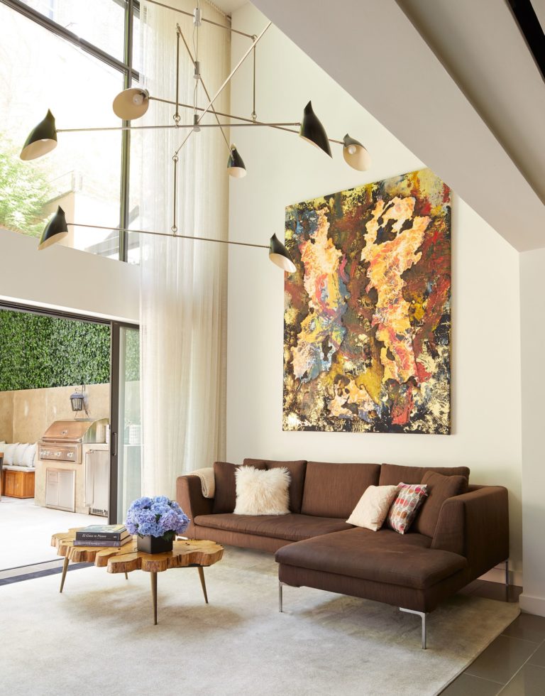
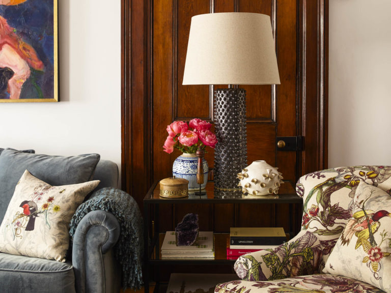
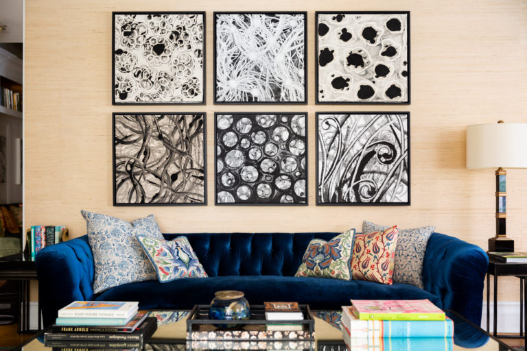
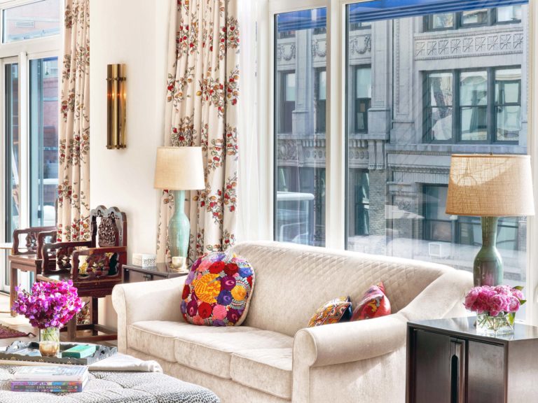
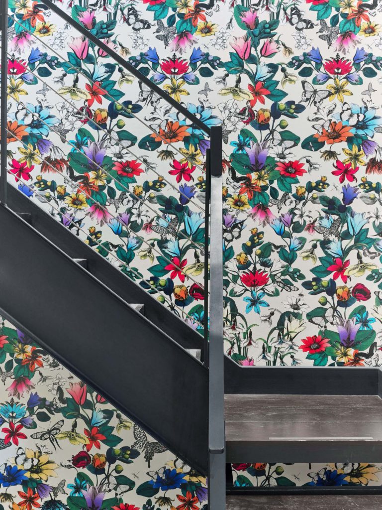
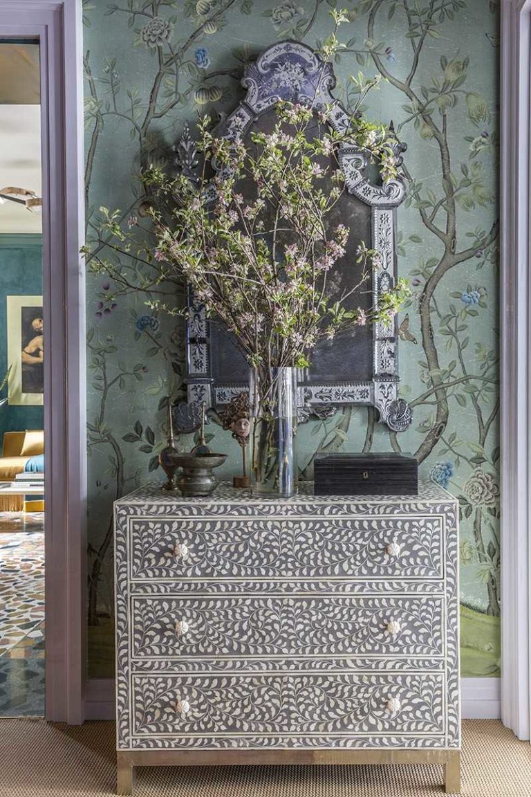
Central Park West Interior Design seen in ON STYLEIt was time to start over. Time to move. And time to cross the park into a new life…a life we helped our client re-define. Kati Curtis Design created a new home and a Central Park West Interior Design. We gave it form through Art Déco choices that we mixed with 18th century pieces. We shaped it with modern touches. And then we highlighted it in ways that were always meaningful to her, with pillows featuring her love of needlepoint, framed etchings of Italian archaeological expeditions (another passion), the Venetian Murano glass chandelier (again, speaking to her love of Italy). Her new story plays out against a backdrop that mixes old and new, the familiar and surprising, the bold and refined. Distances can be funny—physically, this home was only across the park, but emotionally, it feels like light years away. We had the idea of creating her own bedroom garden paradise above Central Park; designing the custom chinoiserie wallpaper let us start her down this private garden path, while a custom shade (with the same wallpaper) created a calm and soothing uninterrupted pattern all around the room. Again, the client’s love of red was brought in, but this time we used the rug to express it. One directive brought the guest room into focus: red. Our goal was beauty without being over stimulating. And so we balanced the room, with pinks and blue...
Loading...
Penthouse Interior Design featured on One Kings Lane Two sisters, 20-somethings, (first) asked us to help find an apartment in a clean, healthy, building. Their greater desire was to live in a home where their chemical sensitivities were relieved, and this Penthouse interior design in Chelsea, NY with its new construction and LEED certification, fit their needs. That's where Kati Curtis Design came in. Over the dining room table we hung a raindrop crystal fixture, its 112 individual “ raindrops” add light + beauty + amazement for everyone who sees it. With this part of our work fulfilled, the sisters (next) asked us to design and manufacture many pieces of their furniture, with their goal again of being chemical free. We expanded their goal– we wanted it to be healthy, and stylish, and fun, and uniquely them. We started with antiques—so old they couldn’t possibly contain any new resources, they met all of our health standards, while also letting us add a different feel. And quite frankly– they were just so beautiful it was hard not to use them. The leopard chaise? Aka “ The Tigress?” It’s on “ loan” from their grandmother, who the sisters are very close to. Those old Bali doors? Found them on a trip to the island with my husband. (He thought we were vacationing, I didn’t tell him we were scouting.) The mix of Morocco, India, and Bali, all unified by the colors. The other...
Chelsea Interior Design featured on Open House New YorkFor this Chelsea Interior Design project, the client said to us: “This is going to be our home for a very long time and we want it to reflect us.” And then they added something else, “ Do what you do best.”With that vote of confidence, but more than that–with their complete trust, we began designing their 2800 square foot Chelsea Penthouse. (And soon Kati Curtis Design began gutting it!) But the thought stayed with us, and throughout the journey we kept asking ourselves, “ What do we do best?” This was a white box begging for warmth. We created that with walnut wood in the kitchen, then added more with the colorful marble with its green, gold, brown specks. All along the way we found clues to the answer. It was there when we pushed them towards a new level of pattern and color. It was there again when we asked them to consider an evocative mix of antiques (hello, 14th century? Indian chair) with the new (well, relatively new mid-century modern.) And when we asked them to stretch, (okay, leap) out of their comfort zone. (“A flower wall?”) We brought them more variety, gave them more texture, added more layers because each one reflected who they are: equestrian elements–her love for horses; Indian influences– their love of travel, and a room dedicated to extended visits– their love of family.The walls?...
Kips Bay Decorator Show House seen in Architectural Digest The Path to Enlightenment – Kips Bay Decorator Show House. Top Interior Designers, including Kati Curtis Design, were chosen to design this year’s Show House. Having been awarded two of the main staircases at the Kips Bay Decorator Show House I saw a unique opportunity to express what is not only an aesthetic, but personal vision of mine. Using the metaphor “The Path to Enlightenment,” I sought to carry people from floor to floor with beauty, while creating an uplifting experience. But, along the Path there are many beautiful and seductive distractions. Illustrating their allure, we chose a gorgeous DeGournay intricate patterned wall covering on the stairs and landings, and then selected furniture with exquisite elements in the fine workmanship. On the 4th floor landing, where we placed the almost dark and intimidating, but stunningly seductive Gothic side chairs, paired with a very contemporary burled wood cabinet trimmed with blue lacquer. Incorporating Anglo-Indian elements let us contrast the very traditional against the very contemporary – the swooping sculptural balustrade, which we painted in a strong, dark, reflective navy blue, emphasizing the flowing curves of the stair. Moving higher up the stairs, the wallpaper loses all complications and becomes a soothing, quiet sea green, a signal that we’ve reached our ultimate destination – Freedom—the end of the Path.
End of content
No more pages to load