Loading...
In addition to beautiful interiors, Kati Curtis also provides tailored advisory for Private Equity in Customized Furniture & Design. The world of private equity is one of ambition, transformation, and untapped potential. For firms looking to invest in the lucrative fields of interior design and online furniture retail, the opportunities are vast—but so are the complexities. When investing in specialized industries like these, it takes more than just financial acumen. It takes an insider’s understanding of the artistry behind the products, the nuances of customer behavior, and the intricate supply chains that drive this market. This is where our advisory services come into play. Designing Success Through Industry Expertise An investment in the interior design or online furniture sector is more than a numbers game; it's about understanding the heart of the industry. The interior design world thrives on customization, storytelling, and personalized experiences, while online furniture retail demands the right marketing, scalability, and seamless customer journeys. Kati is a seasoned expert with both financial and industry-specific experience, making her uniquely positioned to guide private equity firms toward successful investment outcomes. Why Invest in Interior Design and Online Furniture? Both interior design and online furniture retail sectors are poised for growth, driven by changing consumer lifestyles and increasing attention to home aesthetics. Here's why these industries are compelling investment targets: Elevated Demand: With the rise of remote work and shifting priorities, more people are investing in their living spaces, fueling...
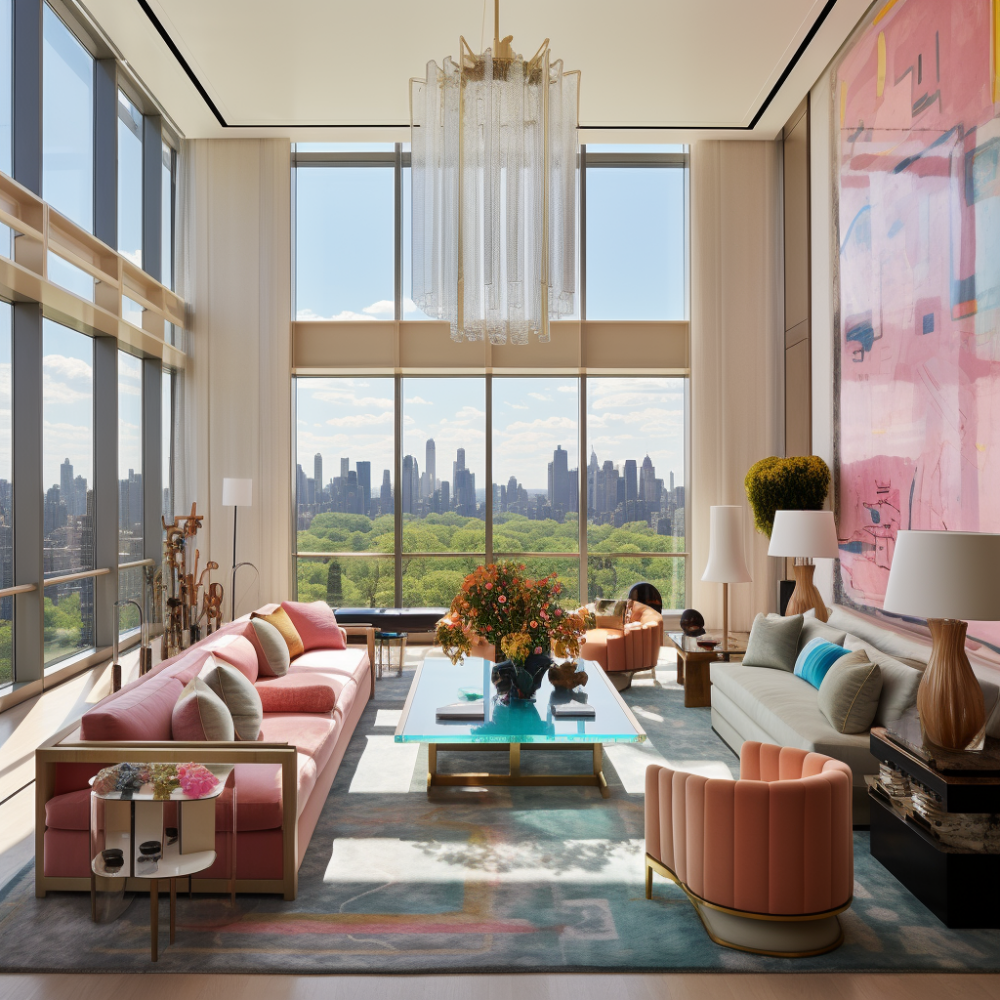
We are thrilled to be a part of Design Share - a group of the Top 10 NYC Interior Design Firms that gather each month to share tips, challenges, and offer resources and support to each other. If you have recently purchased an apartment in one of the luxurious buildings in Manhattan, the interiors have to be just as awe-inspiring. Whether you want a traditional or modern aesthetic, an expert interior designer can help in bringing your dream apartment to life. Our group is comprised of many design firms with different tastes and styles, and it's important to choose a designer whose work resonated with your personal aesthetic. Kati Curtis Design: Kati Curtis Design is an award-winning interior design firm specializing in high-end residential and home renovation projects. Kati is admired for her ability to create layered interiors that combine function, texture, and color. The firm's design aesthetic is contemporary, timeless, and infused with color, art and personality. Lisa Frantz Interiors: Lisa Frantz Interiors is an award-winning interior design firm focused on residential projects. Their approach is to create a space that reflects its owner's personality and style. Lisa Frantz Interiors offers services from design concept consultation to full project management. Neal Beckstedt: Neal Beckstedt Studio is known for its timeless, sophisticated designs. The firm's design philosophy is grounded in a keen sense of proportion and scale, combined with the use of quality materials. Neal Beckstedt specializes in creating spaces...
Featured

As Featured in Press

Don't you want to be the first to hear when Kati updates her shop with one-of-a-kind finds?
Subscribe to Our Newsletter

All About NYC
Loading...
In addition to beautiful interiors, Kati Curtis also provides tailored advisory for Private Equity in Customized Furniture & Design. The world of private equity is one of ambition, transformation, and untapped potential. For firms looking to invest in the lucrative fields of interior design and online furniture retail, the opportunities are vast—but so are the complexities. When investing in specialized industries like these, it takes more than just financial acumen. It takes an insider’s understanding of the artistry behind the products, the nuances of customer behavior, and the intricate supply chains that drive this market. This is where our advisory services come into play. Designing Success Through Industry Expertise An investment in the interior design or online furniture sector is more than a numbers game; it's about understanding the heart of the industry. The interior design world thrives on customization, storytelling, and personalized experiences, while online furniture retail demands the right marketing, scalability, and seamless customer journeys. Kati is a seasoned expert with both financial and industry-specific experience, making her uniquely positioned to guide private equity firms toward successful investment outcomes. Why Invest in Interior Design and Online Furniture? Both interior design and online furniture retail sectors are poised for growth, driven by changing consumer lifestyles and increasing attention to home aesthetics. Here's why these industries are compelling investment targets: Elevated Demand: With the rise of remote work and shifting priorities, more people are investing in their living spaces, fueling...
We are thrilled to be a part of Design Share - a group of the Top 10 NYC Interior Design Firms that gather each month to share tips, challenges, and offer resources and support to each other. If you have recently purchased an apartment in one of the luxurious buildings in Manhattan, the interiors have to be just as awe-inspiring. Whether you want a traditional or modern aesthetic, an expert interior designer can help in bringing your dream apartment to life. Our group is comprised of many design firms with different tastes and styles, and it's important to choose a designer whose work resonated with your personal aesthetic. Kati Curtis Design: Kati Curtis Design is an award-winning interior design firm specializing in high-end residential and home renovation projects. Kati is admired for her ability to create layered interiors that combine function, texture, and color. The firm's design aesthetic is contemporary, timeless, and infused with color, art and personality. Lisa Frantz Interiors: Lisa Frantz Interiors is an award-winning interior design firm focused on residential projects. Their approach is to create a space that reflects its owner's personality and style. Lisa Frantz Interiors offers services from design concept consultation to full project management. Neal Beckstedt: Neal Beckstedt Studio is known for its timeless, sophisticated designs. The firm's design philosophy is grounded in a keen sense of proportion and scale, combined with the use of quality materials. Neal Beckstedt specializes in creating spaces...
Gone are the days when a grand entryway was a symbol of wealth and status. Nowadays, modern design trends prioritize practicality, space efficiency, and a seamless connection between the entryway and the rest of your home. If you're looking to update your entryway, it's important to know the interior design trends to avoid that can consume valuable space and compromise your living experience. In this guide, we'll go over some entryway trends to avoid and offer tips on how to create a welcoming and inviting entryway that suits your lifestyle. Here are interior design trends to avoid for entryways: Large, extravagant, two or three-story grand entry halls were popular in the past, but now they're outdated and impractical. These types of entryways can consume valuable usable space, making it challenging to blend them with the rest of your home. They can also be a hassle to maintain and decorate, particularly for people who want to infuse their personality into the space. Instead, modern design trends lean toward creating welcoming, inviting entryways that flow seamlessly into the rest of the home. Contemporary design values practicality, efficiency, and a seamless connection between the entryway and the rest of the home. In addition to the grand entryways, white and monochromatic entryways are an Interior design trends to avoid. While they used to be a symbol of purity and sophistication, they now look bland and unoriginal. If you want your entryway to reflect your...
Loading...
Put simply, an induction-cooker element ("burner") is a powerful, high-frequency electromagnet, with the electromagnetism generated by sophisticated electronics in the "element" under the unit's ceramic surface. When a good-sized piece of magnetic material such as a stainless steel skillet is placed in the magnetic field that the element is generating, the field transfers ("induces") energy into that metal.
In hopes of avoiding the last minute scramble to try and make the virtually impossible happen for a client, I wanted to provide a post on basic tenant fit-out costs in NYC. We want our potential clients to be armed with the proper information to plan wisely, from both a timing and a budget standpoint.
How much carpet goes to landfill? It is estimated 5 billion pounds of carpet was sent to the landfill in 2003. The previous year, The Carpet America Recovery Effort was formed and the numbers have been decreasing every since. But there is still a lot of work to do to truly eliminate this global dilemma.
I had never been to the USVI before, and as I was in awe of their beauty, it got me thinking about inspiration from nature. Living in the Urban Jungle, winter in New York can literally be black and white. But as I commonly think of "natural" colors as being fairly neutral, my surroundings on St. John were anything but. The islands inspired me to think of color in an entirely new way, and to add a dose of tropical inspiration to my designs as we venture into the long winter ahead!
Which got me thinking...Although it's never an exact science, there are a few guidelines we can use to determine what your project will end up ROUGHLY costing before even beginning the design.
End of content
No more pages to load




Pingback: The New Guard: Kati Curtis of Kati Curtis Design | CJ Dellatore - Resources For Design Professionals