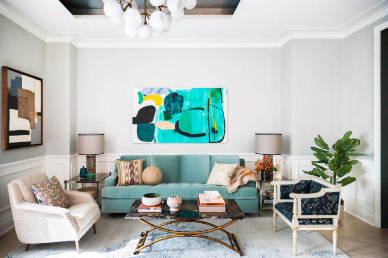
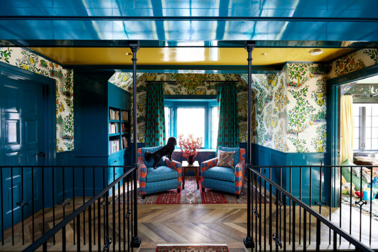
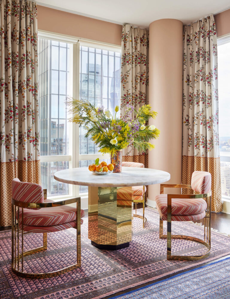
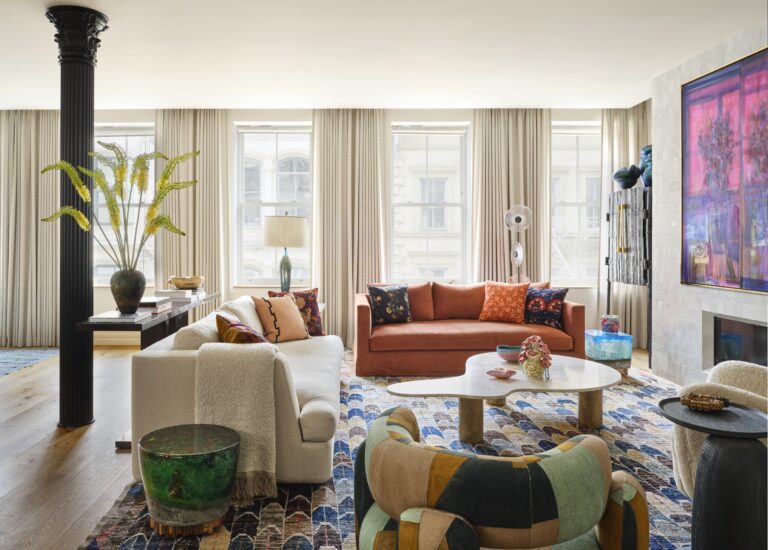
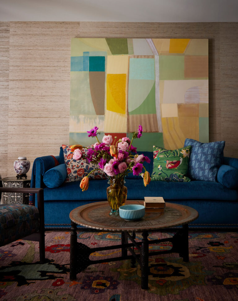
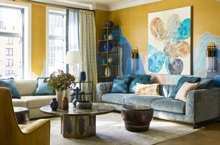
Colorful Rye Interior Design, as seen in Luxe Magazine. A bright house in the suburbs with a rye interior design is the dream house for many. Although it is too cliché, the New York designer Kati Curtis was able to rethink it and give the traditional design a fresh turn. When the young couple approached Kati Curtis for their dream rye interior design, Curtis knew she had to make the house as lively as the couple was. So to create their forever home, she decided to create a comfortable space where the couple and their heirs would sit near the Moroccan tiles, linger among the floral wallpapers and enjoy the edgy contemporary art. The house was to be a mixture of old and new: a traditional approach spiced up with a young, fun, and modern vibe. As the couple wanted modern elements but did not wish the house to feel too contemporary, Curtis's decision was clear. "I told them we could mix old and new seamlessly, and it would only add more character." And that's precisely what Curtis did. Right from the start, you get the taste of what is to come by entering the double-height entrance hall. So don't be surprised by the Georgian-style commode you see against the gleaming blue; the husband's late grandfather was a collector, and this is his signature. The antique commode follows the trendy bulbs that hand from the contemporary lamp along with the...
Loading...
Colorful Interior Design, New York City Pied a Terre As seen in Luxe Magazine As seen on Open House TV For New York Interior designer Kati Curtis, trust was paramount as she helped her clients realize an NYC design dream they had first conjured up decades ago. Back then, as newlyweds living in a beach apartment at the foot of the Andes Mountains, they imagined an apartment in New York City located close to the Museum of Natural History. Fast forward some 25 years, and, after securing a place in a new-construction building–sight unseen–they were ready to move ahead. After finding Curtis online, and meeting her just once, they entrusted the designer with the job. “That’s what made it special,” she says. “They told me, ‘We know your style, we know what you do, and we know you’re going to do something wonderful for us.’ It was such a gift.” So complete was the homeowners’ faith in Curtis that they expressed only a few wishes. In South America, their home was traditional with heavy draperies, fabrics and trims, and the wife had presented Curtis with samples from a trip to the D&D Building that leaned in that direction. “She wanted to express that depth and quality and detail,” says Curtis. “Our job was to do that in a New York-modern way.” Achieving that required laying the right foundation, since, says the designer, “New construction apartments can be cold and gray. The standard finishes...
Tribeca Interior Designer, Kati Curtis Design, completely renovated the interior from top to bottom to accommodate their transition not only from Canada to the US, but also from suburban to city life as they downsized from a large home in the Toronto suburbs. They wanted the details and comfort of their traditional home in Canada, with an environment conducive to their new lifestyle. The original apartment entry had low ceilings and no storage at all. We wanted to create a sequence of discovery by designing a cerused oak built-in with a coat closet clad in antiqued mirror. First, adjustable shelves house finds from the clients’ vast travels. Then, grasscloth wallpaper in alternating patterns give the walls texture. Looking up, the ceiling is covered in mica flakes adding reflective sparkle from the Remains Lighting flush mounted fixtures. Continuing down, custom rugs add just the right amount of softness and pattern. Finally, an upholstered bench provides a perch for putting on shoes. As you pass through the dark, moody entry, the living area opens up with high ceilings, natural light and an open, airiness. The apartment was delivered to the clients as a “white box”. It was our job as their Tribeca Interior Designer to deliver the same level of craft and detail from their suburban home. We designed the plaster honeycombed ceiling adding another level of architectural interest, while maintaining a contemporary, city feel. The silk hand painted wallpaper adds a...
New Jersey Interior Designers featured in Luxe Magazine A young family swore they’d never leave New York City after New Jersey interior designers Kati Curtis Design renovated their New York City apartment. Until...a pandemic, a few years and two children later. Where...on the Jersey shore they found their dream home. And....once again, called Kati Curtis Design. KCD quickly mobilized. In only 9 months, the tired and dreary 1990's Arts and Crafts home was resurrected into a remarkable and revitalized tour de force. With sensitivity to the architecture of the home, KCD's team of New Jersey interior designers seamlessly mixed the family's contemporary lifestyle with classic details: dark wood floors were lightened, as was the outdated dark woodwork. Furniture choices supported all-season living, and coming from Manhattan, open space was a paramount importance (of course!). KCD’s design allows for large family gatherings and parties on the main floor, while a playroom on the 2nd floor gives the children a wide-open play space all their own. Leaving Manhattan for a home on a private beach, with unobstructed views of the Navesink River, was (fairly) easy; KCD’s design, which captured the spirit of this family in this beautiful home, made it possible. Leaving the City for the suburbs was a hard decision for this family, but KCD incorporated all of the conveniences of City living into the design of the home. A home office, home gym and yoga room, separated playroom and outdoor...
Townhouse interior design featured in Architectural Digest A young couple had a growing family and with it came growing needs- including a townhouse interior design. And so they hired KCD. We listened, we understood, and then we started designing. We created a home– European in flavor and sensibility, yet, cleanly and minimally modern. And because the client are avid art collectors, we approached the project as “designer as curator.” Meaning? We curated the interiors as we would curate a collection, designing a “home as gallery space.” The result? A design perfectly crafted to showcase the family’s taste, as well as their appreciation of culture and beauty We paid attention to every possible detail. Light switches and plugs were made completely flush to the wall to avoid distraction. Our clients wanted a space that was warm and live-able, but still focused on the beauty of the art and gallery like design. The kids rooms were the perfect spot to incorporate a bit more whimsy and color. Although our clients were avid collectors, we were able to find them some really special pieces to add to the girls' rooms that they had never seen before. The rest of the house remained refined yet charming with accents of eccentric pieces, such as the infamous Johannes Albers giant pens as seen in the dining room.
NYC Townhouse Interior Design featured in the Wall Street Journal So when the client called Kati Curtis Design about working on the top two floors of the townhouse, we jumped at the chance to work on this NYC townhouse interior design. The client’s main residence is Palm Springs, CA where they live in a very modern home: clean lines, light and glass, but here, in their city dwelling, they wanted warm, cozy, and comfortable. Considering our fondness (alright, passion) for contrasts, we loved hearing this. Over the course of the project we made two observations: 1) people really liked their doors back in 1899, and, 2) they also had different proportions then; the combination added interesting challenges to our process. One way we dealt with it was by designing a custom sofa to fit perfectly between the older proportioned (aka: smaller) spaces between the doors (well, two of them.) We wanted to reflect the vintage era of the townhouse, and at the same time acknowledge the hip and modern nature of this couple; we decided on “vintage with a twist.” One way we expressed this was through the wallpaper, by Timorous Beasties, in the dining room; it captures the Victorian feel of the home but with the most modern pattern. Another wallpaper, this one in “the family room,” looks like a sweet Victorian pattern…from afar. Upon closer inspection something far less benign is revealed: a pattern of evil-looking moths. The...
Central Park West Interior Design seen in ON STYLE It was time to start over. Time to move. And time to cross the park into a new life…a life we helped our client re-define. Kati Curtis Design created a new home and a Central Park West Interior Design. We gave it form through Art Déco choices that we mixed with 18th century pieces. We shaped it with modern touches. And then we highlighted it in ways that were always meaningful to her, with pillows featuring her love of needlepoint, framed etchings of Italian archaeological expeditions (another passion), the Venetian Murano glass chandelier (again, speaking to her love of Italy). Her new story plays out against a backdrop that mixes old and new, the familiar and surprising, the bold and refined. Distances can be funny—physically, this home was only across the park, but emotionally, it feels like light years away. We had the idea of creating her own bedroom garden paradise above Central Park; designing the custom chinoiserie wallpaper let us start her down this private garden path, while a custom shade (with the same wallpaper) created a calm and soothing uninterrupted pattern all around the room. Again, the client’s love of red was brought in, but this time we used the rug to express it. One directive brought the guest room into focus: red. Our goal was beauty without being over stimulating. And so we balanced the room, with pinks and...
Penthouse Interior Design featured on One Kings Lane Two sisters, 20-somethings, (first) asked us to help find an apartment in a clean, healthy, building. Their greater desire was to live in a home where their chemical sensitivities were relieved, and this Penthouse interior design in Chelsea, NY with its new construction and LEED certification, fit their needs. That's where Kati Curtis Design came in. Over the dining room table we hung a raindrop crystal fixture, its 112 individual “ raindrops” add light + beauty + amazement for everyone who sees it. With this part of our work fulfilled, the sisters (next) asked us to design and manufacture many pieces of their furniture, with their goal again of being chemical free. We expanded their goal– we wanted it to be healthy, and stylish, and fun, and uniquely them. We started with antiques—so old they couldn’t possibly contain any new resources, they met all of our health standards, while also letting us add a different feel. And quite frankly– they were just so beautiful it was hard not to use them. The leopard chaise? Aka “ The Tigress?” It’s on “ loan” from their grandmother, who the sisters are very close to. Those old Bali doors? Found them on a trip to the island with my husband. (He thought we were vacationing, I didn’t tell him we were scouting.) The mix of Morocco, India, and Bali, all unified by the colors. The...
Chelsea Interior Design featured on Open House New York For this Chelsea Interior Design project, the client said to us: “This is going to be our home for a very long time and we want it to reflect us.” And then they added something else, “ Do what you do best.”With that vote of confidence, but more than that–with their complete trust, we began designing their 2800 square foot Chelsea Penthouse. (And soon Kati Curtis Design began gutting it!) But the thought stayed with us, and throughout the journey we kept asking ourselves, “ What do we do best?” This was a white box begging for warmth. We created that with walnut wood in the kitchen, then added more with the colorful marble with its green, gold, brown specks. All along the way we found clues to the answer. It was there when we pushed them towards a new level of pattern and color. It was there again when we asked them to consider an evocative mix of antiques (hello, 14th century? Indian chair) with the new (well, relatively new mid-century modern.) And when we asked them to stretch, (okay, leap) out of their comfort zone. (“A flower wall?”) We brought them more variety, gave them more texture, added more layers because each one reflected who they are: equestrian elements–her love for horses; Indian influences– their love of travel, and a room dedicated to extended visits– their love of family....
Kips Bay Decorator Show House seen in Architectural Digest The Path to Enlightenment – Kips Bay Decorator Show House. Top Interior Designers, including Kati Curtis Design, were chosen to design this year’s Show House. Having been awarded two of the main staircases at the Kips Bay Decorator Show House I saw a unique opportunity to express what is not only an aesthetic, but personal vision of mine. Using the metaphor “The Path to Enlightenment,” I sought to carry people from floor to floor with beauty, while creating an uplifting experience. But, along the Path there are many beautiful and seductive distractions. Illustrating their allure, we chose a gorgeous DeGournay intricate patterned wall covering on the stairs and landings, and then selected furniture with exquisite elements in the fine workmanship. On the 4th floor landing, where we placed the almost dark and intimidating, but stunningly seductive Gothic side chairs, paired with a very contemporary burled wood cabinet trimmed with blue lacquer. Incorporating Anglo-Indian elements let us contrast the very traditional against the very contemporary – the swooping sculptural balustrade, which we painted in a strong, dark, reflective navy blue, emphasizing the flowing curves of the stair. Moving higher up the stairs, the wallpaper loses all complications and becomes a soothing, quiet sea green, a signal that we’ve reached our ultimate destination – Freedom—the end of the Path.
End of content
No more pages to load