As a designer, one of my favorite tools to work with is color! In a world full of white and neutral "design inspiration", it's always refreshing to pull out an exciting new color palette to play with. While we've all worked with the standard light blues or even a darker green here and there- we love to experiment with color and make bold but luxurious color combinations. Here are some of our top tips for creating unexpected color schemes work in your home!
Monochrome
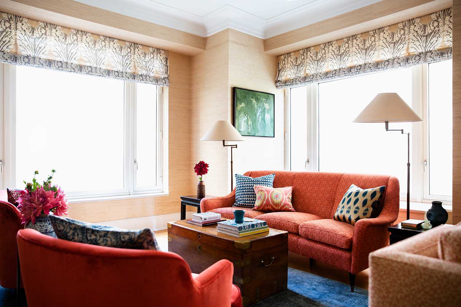
One of the easiest ways to start incorporating color into space is to go monochromatic. If your favorite color is red, a whole room of red may be too much. But using a mix of light pink, red, and even orange made this room feel warm and inviting, but still very open and easy on the eyes. Use the boldest color sparingly, and add lighter tones of the same color to keep the light flowing and still complement your main color.
Complimentary Colors
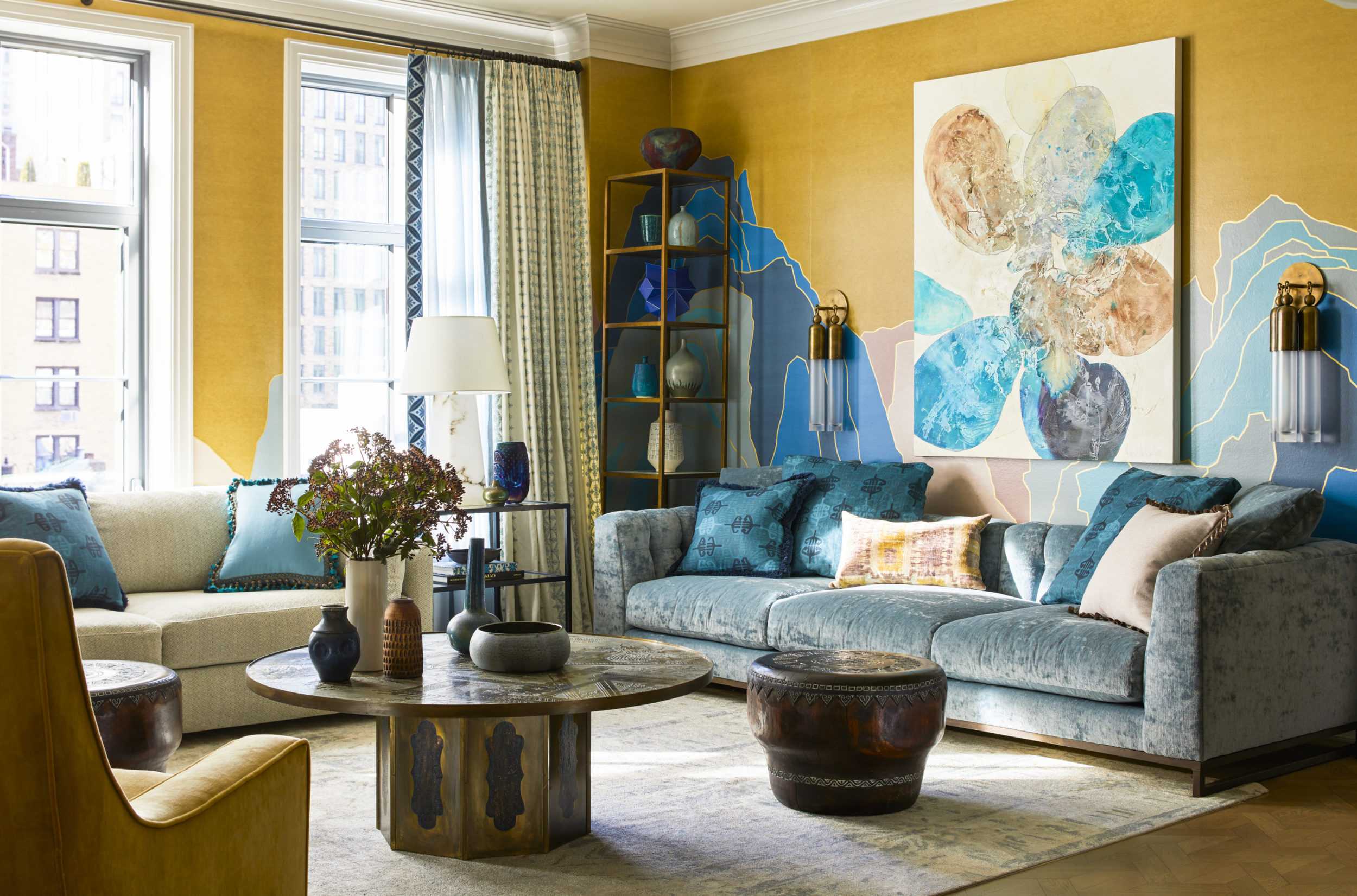
The next option to try is complementary colors! When you look at the color wheel, pick two colors that are opposite from each other and build from there. This gorgeous Upper West Side Pied a Terre was built off of a color scheme of blue and yellow, and using these two bold colors along with their "color child" a stunning green/teal space feel like a perfect harmony. Of course, we balanced the room with neutral tones in the pillows and textiles to keep things calm and beautiful.
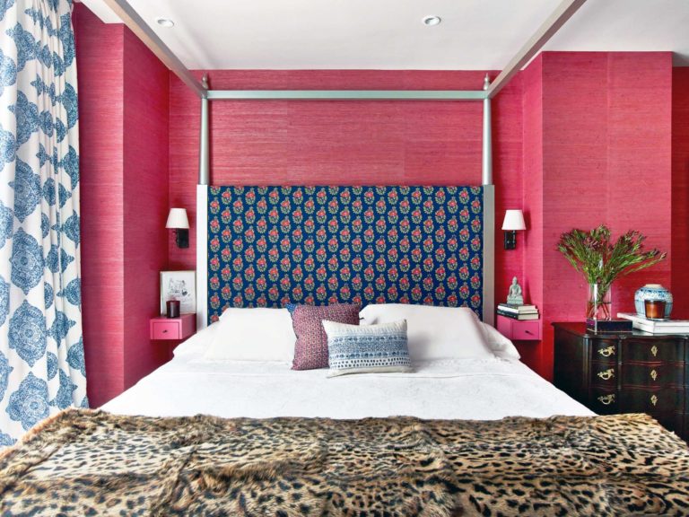
Cool and Warm
When in doubt, cool and warm color mixes usually make for the perfect unexpected color schemes. In this Chelsea Penthouse, we balanced out the bright warm red walls with that gorgeous deep blue to really make the space pop. These two colors paired so well together and really made a space that felt different and fun but still inviting after a long day. As mentioned above, we counteracted these bold colors with neutral bedding and accents to make sure the space felt balanced.
Thank you so much for tuning in this week! Make sure to follow us on Instagram to see what we're up to in the studio and on our site visits. See you next week!